The Illusion of Space: Smart Kitchen Design That Feels Bigger
The Illusion of Space: How Smart Kitchen Design Tricks the Eye (and Makes Smaller Spaces Feel Bigger)
When a kitchen feels beautifully designed, it’s rarely because it’s large.
It’s because the proportions are balanced…
the colors feel calm…
and every surface works together instead of competing for attention.
Luxury, in many ways, is a perception game.
Some kitchens look expensive not because they cost more — but because they were designed with intention, restraint, and visual intelligence.
In this guide, we’ll explore how designers use layout, color, texture, light, and flooring continuity to create the illusion of space — especially in kitchens that aren’t naturally large or open.
These are timeless design principles, not trends — the kinds of choices that continue to feel elegant years from now.
Why Some Kitchens Feel Bigger Than They Are
Two kitchens can have the exact same square footage…
…and yet one feels spacious, calm, and luxurious while the other feels tight, busy, and visually heavy.
That difference usually comes down to:
visual weight
proportion
material contrast
how the eye travels through the room
Great design doesn’t just fill space — it shapes the way we experience it. Designers often borrow concepts from:
Scandinavian minimalism
European kitchen studios
Asian spatial harmony and Feng Shui principles
All of which focus on flow, balance, and emotional comfort, not clutter or excess.
The goal isn’t to make a kitchen look bigger for photos — it’s to make it feel more open when you’re actually living in it.
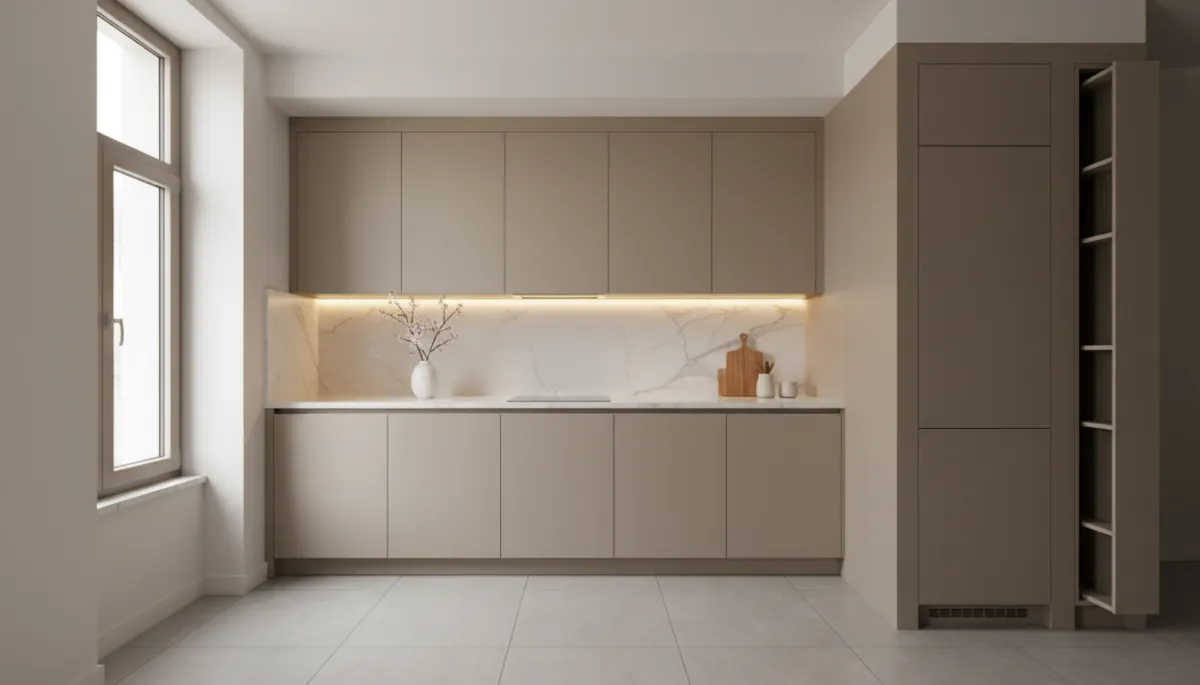
Design Principle #1 — Continuous Lines Create Calm and Openness
Our eyes naturally follow lines — cabinet edges, tile seams, flooring direction. When those lines are broken or interrupted, the room feels choppier and smaller.
When lines continue smoothly, the space feels:
longer
wider
more intentional
This is why designers love clean cabinet layouts and simple hardware placement.
Examples of continuity that visually expand a kitchen:
✔ upper cabinets aligned at the same height
✔ drawers stacked in clean vertical columns
✔ flooring installed in a consistent direction
✔ backsplash tiles flowing in a uniform pattern
Nothing fights for attention — the eye moves effortlessly.
That “effortlessness” is what makes a space feel sophisticated.
Design Principle #2 — Flooring Continuity Makes Rooms Feel Larger
One of the most powerful ways to create visual space:
👉 continue the same flooring across connected rooms
Breaking up floors with multiple materials or colors creates boundaries — and boundaries make spaces feel smaller.
A single, continuous flooring surface:
pulls rooms together
reduces visual interruptions
creates depth and flow
feels cleaner and more modern
It also makes homes feel more luxurious, because high-end interiors almost always avoid patchwork flooring.
This is especially effective when floors:
run lengthwise through the longest wall
use wider planks or larger-format tiles
have matte or soft-sheen finishes
The result?
A room that feels intentional, not pieced together.
Design Principle #3 — Color Tone Matters More Than Color Choice
You can design a beautiful kitchen in white, cream, wood, gray, or deep earthy tones.
What matters most is tone harmony. When too many contrasting colors compete in a small kitchen, the space feels:
busy
fragmented
visually noisy
By contrast, a cohesive palette creates:
serenity
balance
understated luxury
Designers often use a 70 / 20 / 10 balance rule:
70% primary tone (cabinets or walls)
20% supporting tone (countertops or flooring)
10% accent tone (hardware, fixtures, decor)
Nothing shouts.
Nothing demands attention.
Every element contributes to one visual story.
That feeling — calm, quiet confidence — is what makes a space feel expensive.
Design Principle #4 — Matte & Soft Finishes Reduce Visual Clutter
Glossy and reflective finishes bounce light in different directions.
In small kitchens, this can:
highlight imperfections
create glare
increase visual stimulation
Matte and satin finishes instead:
diffuse light softly
hide minor wear beautifully
feel warmer and more natural
evoke European modern styling
Matte textures add depth without heaviness.
They don’t scream for attention — they whisper elegance.
Design Principle #5 — Cabinet Proportion Changes Everything
Cabinets are often the foundation of perceived luxury in a kitchen. Even in modest spaces, well-proportioned cabinetry can make the room feel:
taller
more refined
visually anchored
Subtle design choices make a big difference, such as:
✔ taller upper cabinets instead of a gap at the ceiling
✔ cleaner door styles with fewer unnecessary lines
✔ wider drawer banks vs lots of narrow doors
✔ repeating sizes to create rhythm and symmetry
When cabinetry feels intentional, the entire kitchen feels elevated.
And when storage makes sense, the space functions better — which matters just as much as aesthetics.
Design Principle #6 — The Rule of “Visual Breathing Room”
Luxury design rarely fills every inch of wall space.
Empty space isn’t wasted — it’s relief for the eye.
Strategic restraint can make a kitchen feel:
lighter
calmer
more architectural
A few examples of visual breathing room:
leaving small moments of open wall space
allowing countertops to remain clean and uninterrupted
choosing fewer finishes rather than many
favoring simple alignment over decorative detail
Clutter narrows a room.
Clarity expands it.
Minimalism in this context isn’t stark —
it’s controlled, elegant, and quietly confident.
Design Principle #7 — Lighting That Enhances Depth, Not Brightness
More light isn’t always the goal.
Better-placed light is.
Layered lighting creates dimension:
warm under-cabinet lighting to wash backsplash surfaces
soft overhead diffused lighting
accent lighting to highlight texture or architectural features
Good lighting makes surfaces glow instead of flash.
It creates depth… not glare.
And depth makes a space feel larger — emotionally and visually.
When Design Is Done Well, Space Feels Effortless
The illusion of space isn’t a trick or shortcut.
It’s a thoughtful combination of:
proportion
material harmony
line continuity
tone balance
restraint
And above all…
It’s about how a space makes you feel when you step into it.
A smaller kitchen can feel every bit as luxurious as a larger one — not because it imitates size… but because it understands elegance.
Final Thought
Luxury isn’t always found in bigger spaces, rarer materials, or higher budgets.
More often, it lives in:
intention
harmony
simplicity
proportion
good taste
Design isn’t just something we see — it’s something we experience.
And when design is done with intelligence and sensitivity…
Even the most modest kitchen can feel calm, expansive, and beautifully complete.